
Going Places That I've Never Been
Seeing things that I may never see again

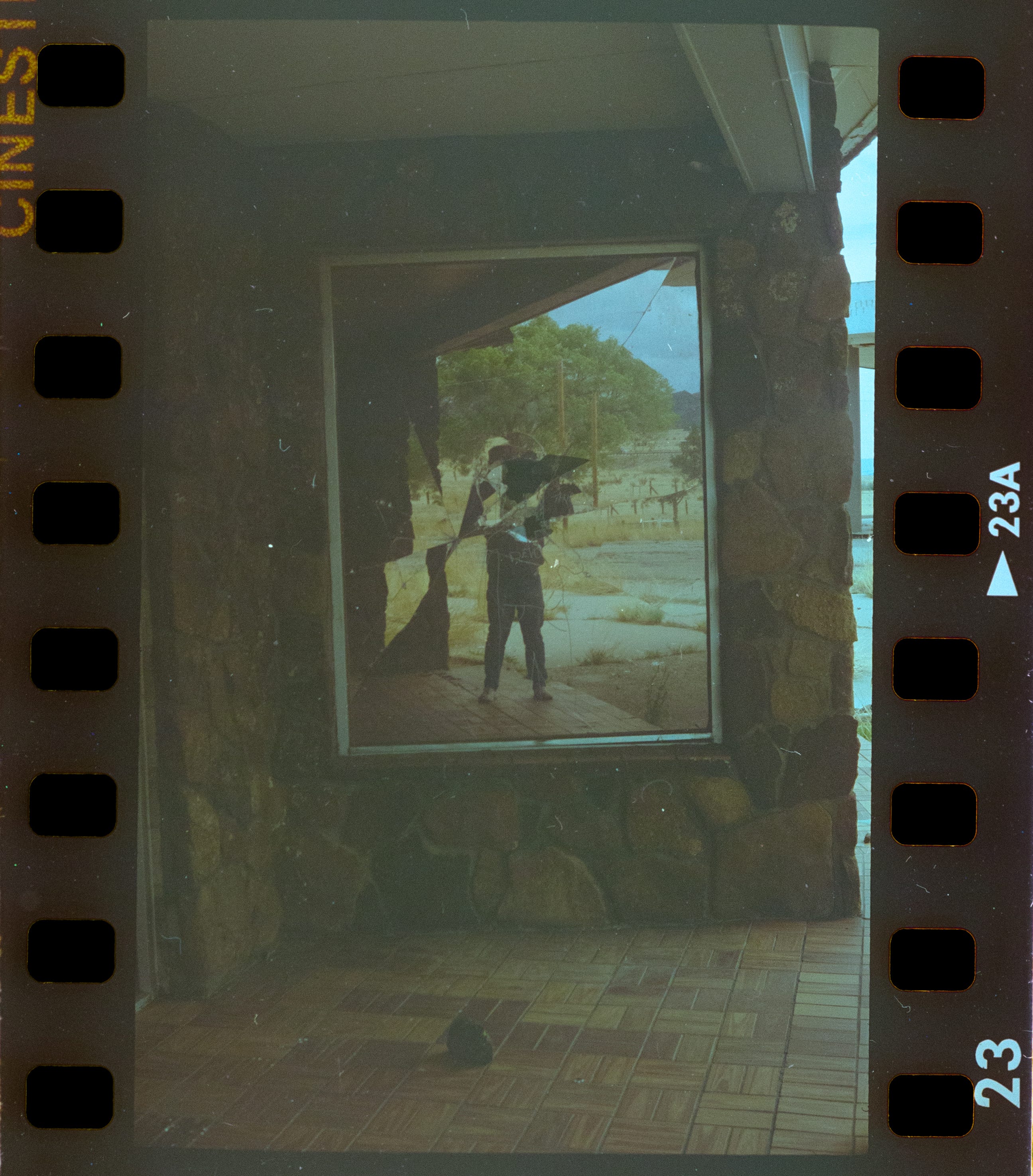
Yesterday, I went to pick up my negatives from the second roll of color film that I put through my Petri 1.9 Color-Corrected Super. I have scanned a few of those frames, and I will post them now (don’t laugh!).
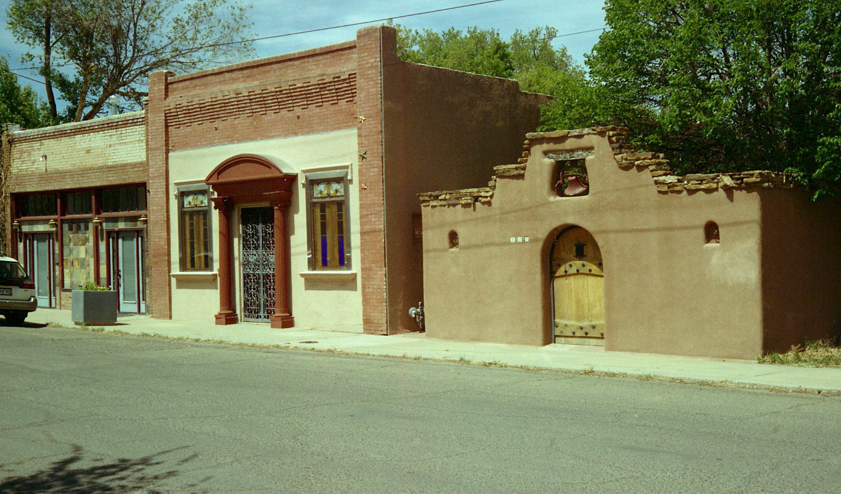
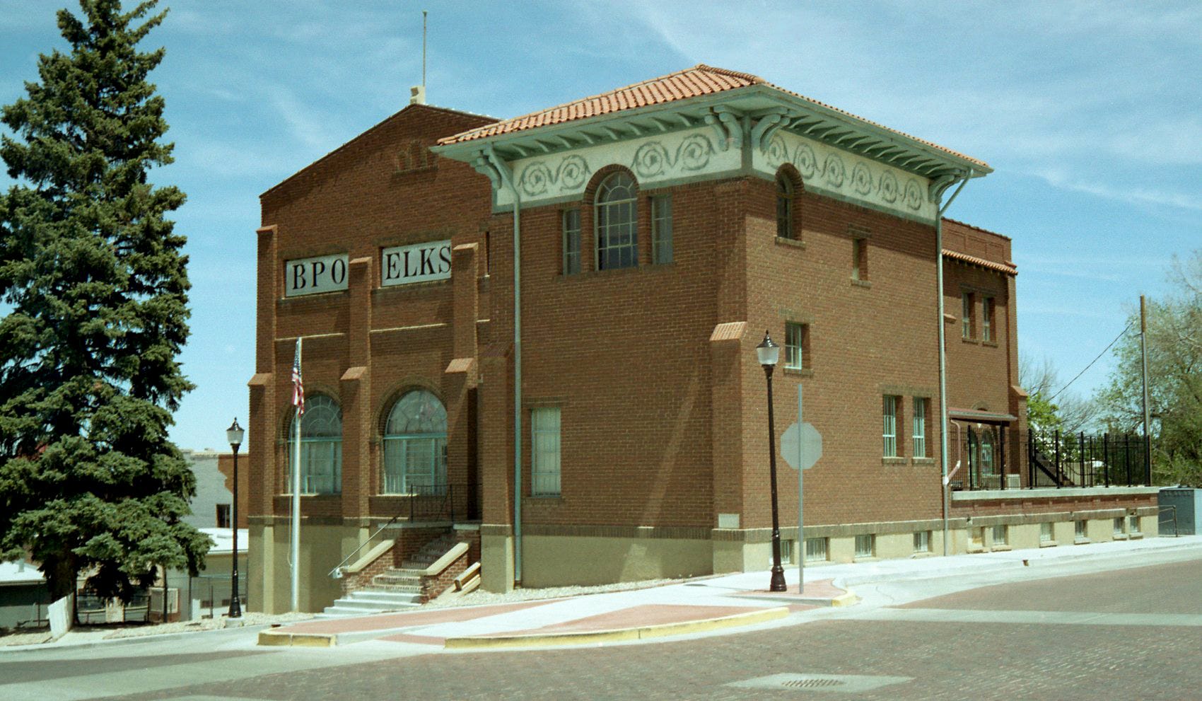
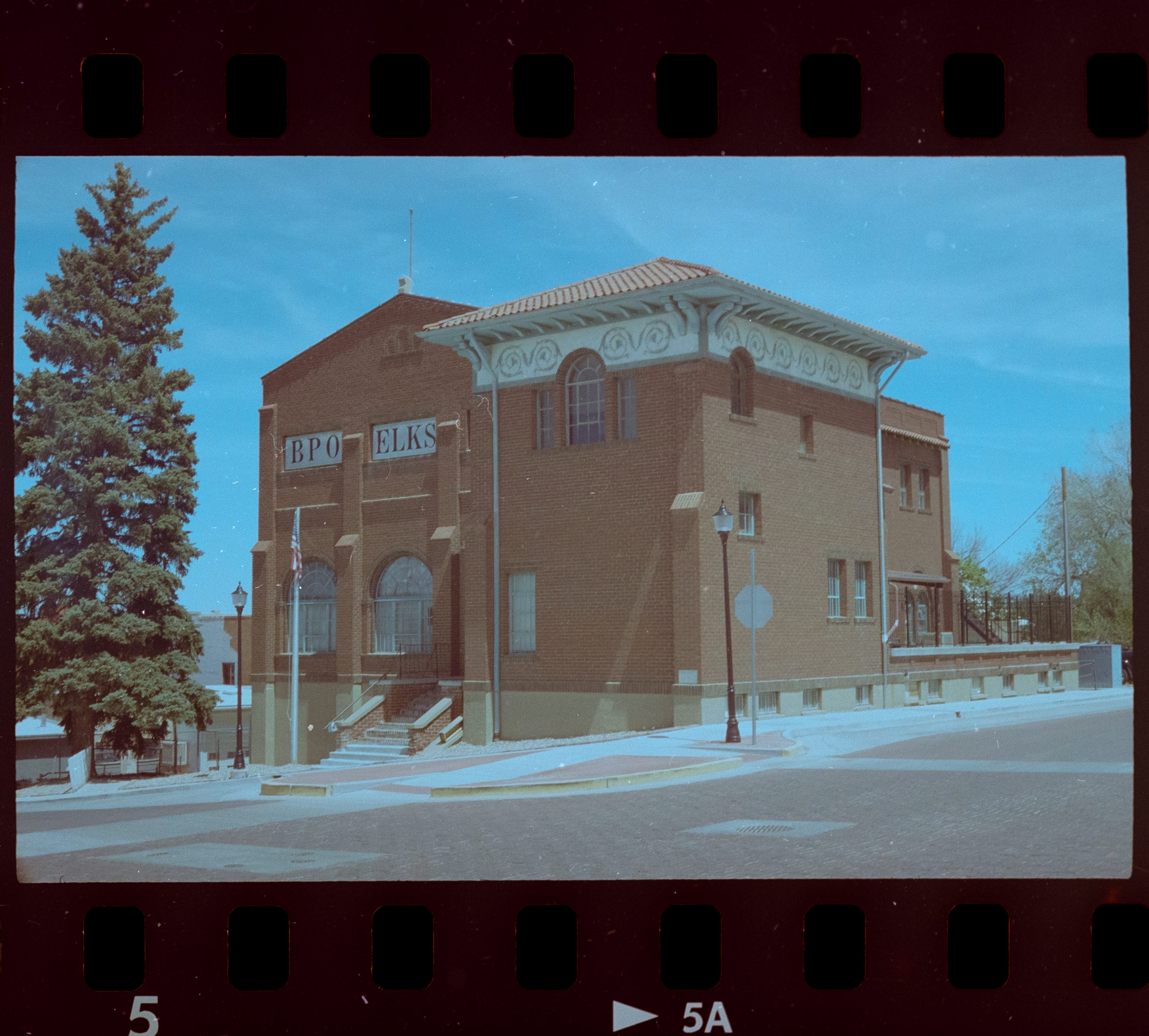
First, here is the original scan, from the lab. It looks good, to me, save for a slight green cast.
Here is my scan, and post…
To be honest, I don’t think the I have improved it at all. I moderated the green, but replaced it with a blue cast, AND, a strange, silvery haze that bother’s my eye. Alas.
This is my first attempt at processing color film, so the learning curve is still steep. I’m happy enough with this attempt, and I can always come back and try something different.
Here is the shot, from the original scan, that I liked the best. Very clear, and the shadow areas were really nice.
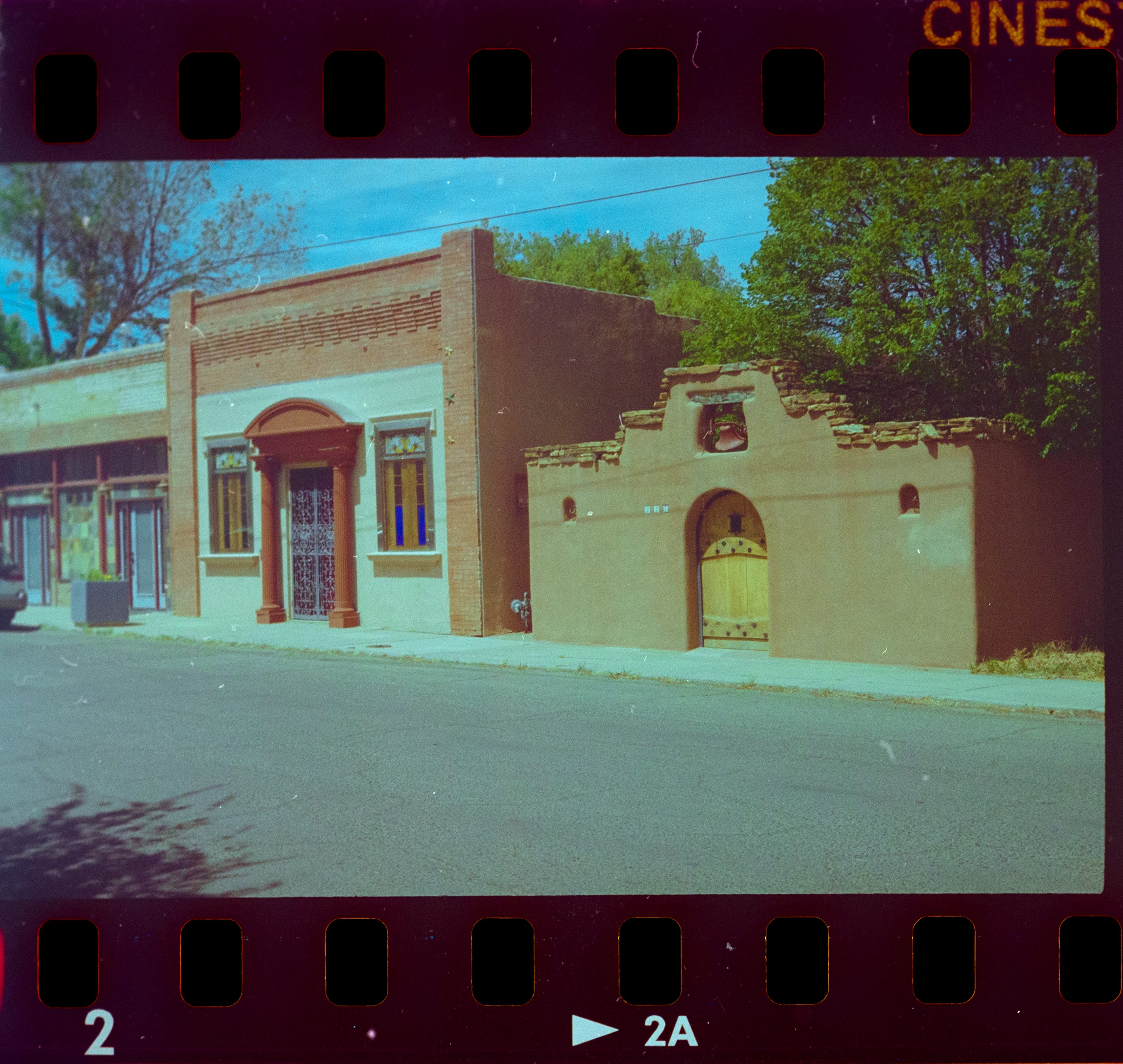
Here, is my processing.
The colors are nowhere near as vibrant as the original scan. This processing looks as though I shot through a dirty window. I gave up on this frame, I just wasn’t able to find the right settings to approximate what the original scan looked like.
Here’s the original scan…
And, here is my work…
Again, a much flatter picture, not nearly as much dynamic range as the original scam. What this picture reminds me of is a digital frame, shot in a Log profile, for later color correction.
Original…
And my version…
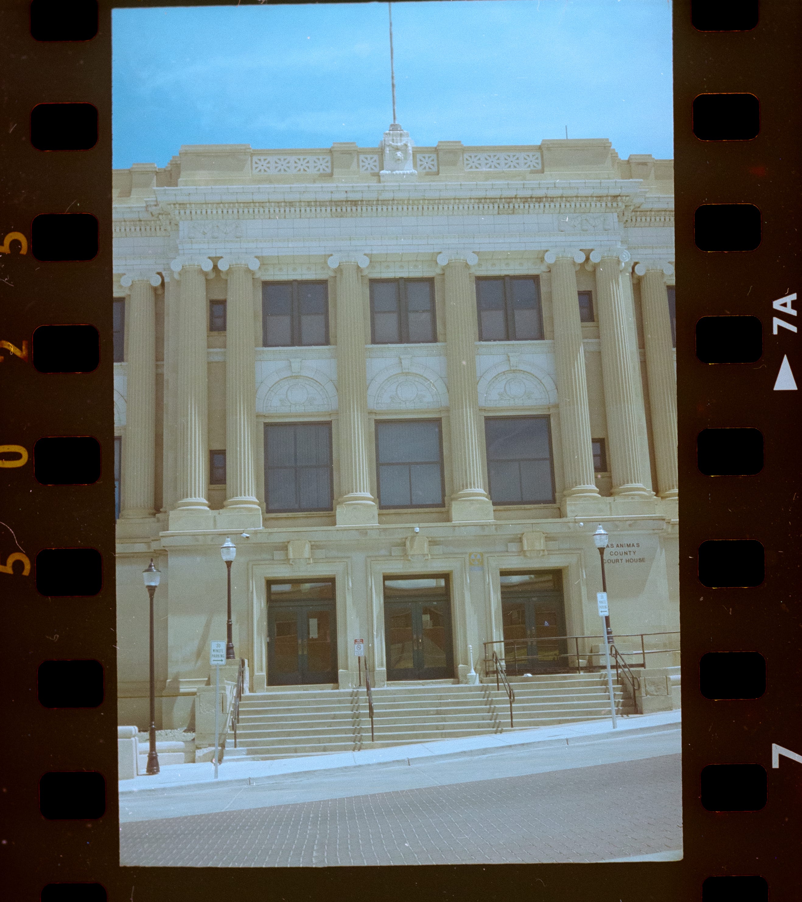
This still has that flattened look of a digital Log file, but I think that I got a little closer to what I was after. In fact, this looks fairly close to what I remember this elevation of the building looking like, in the harsh light of midday.
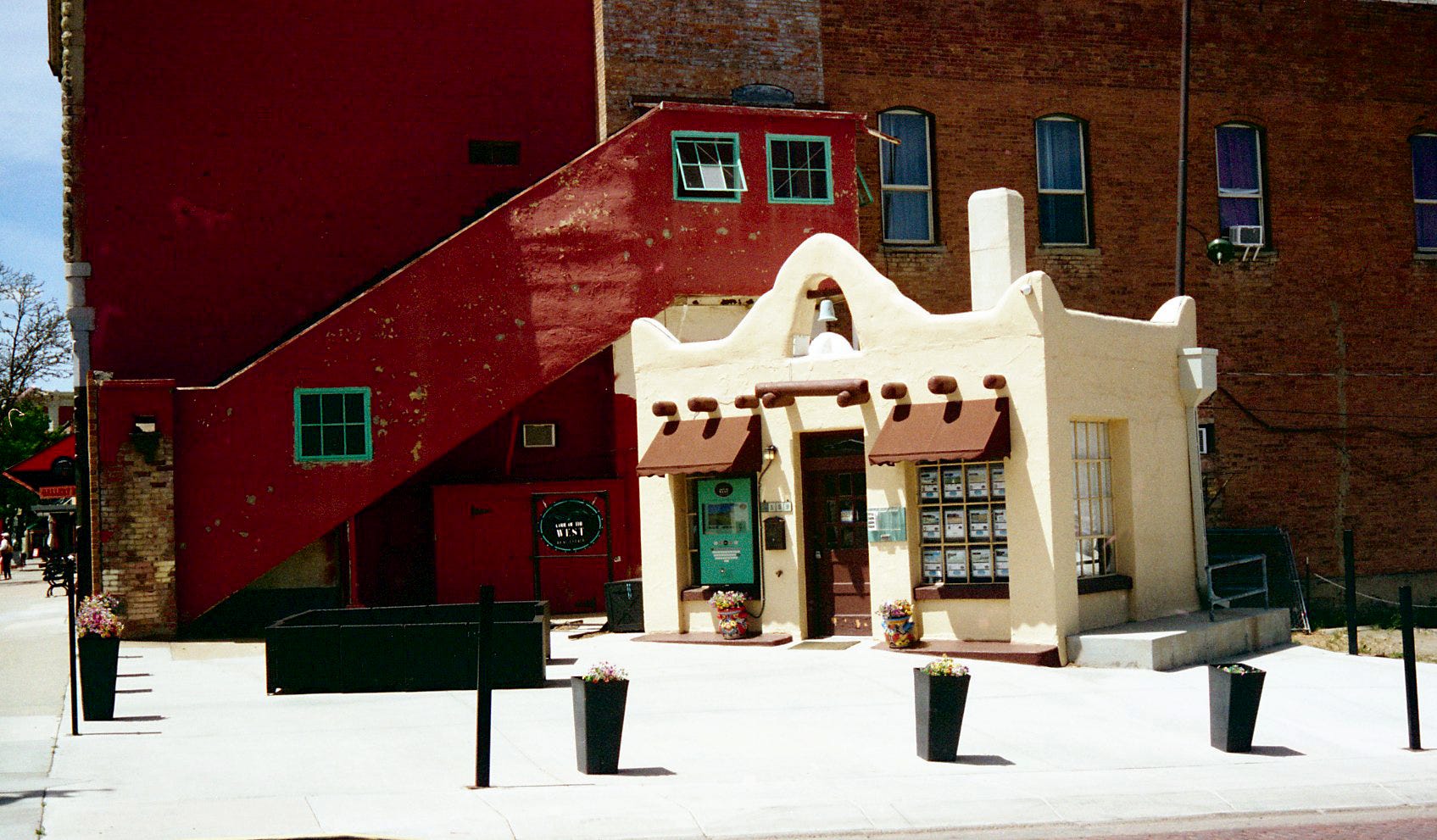
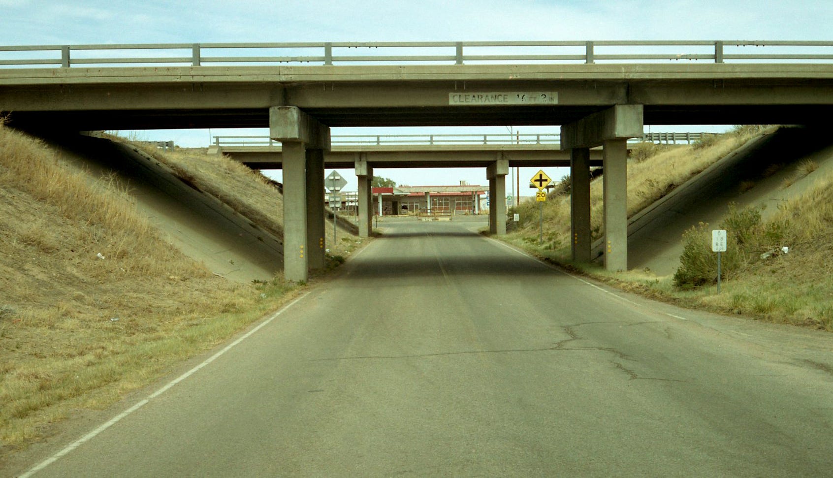
Moving to the filling station…
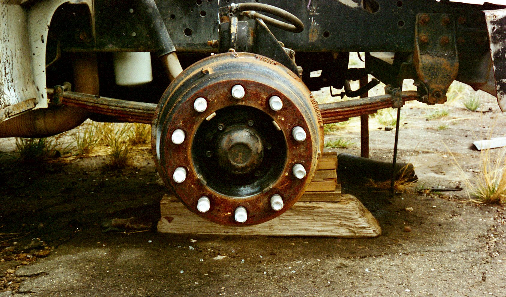
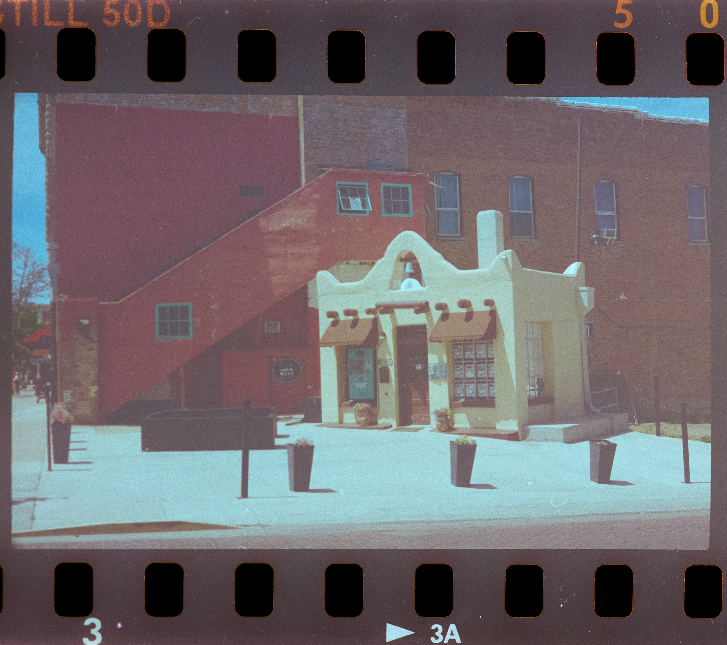
And mine…
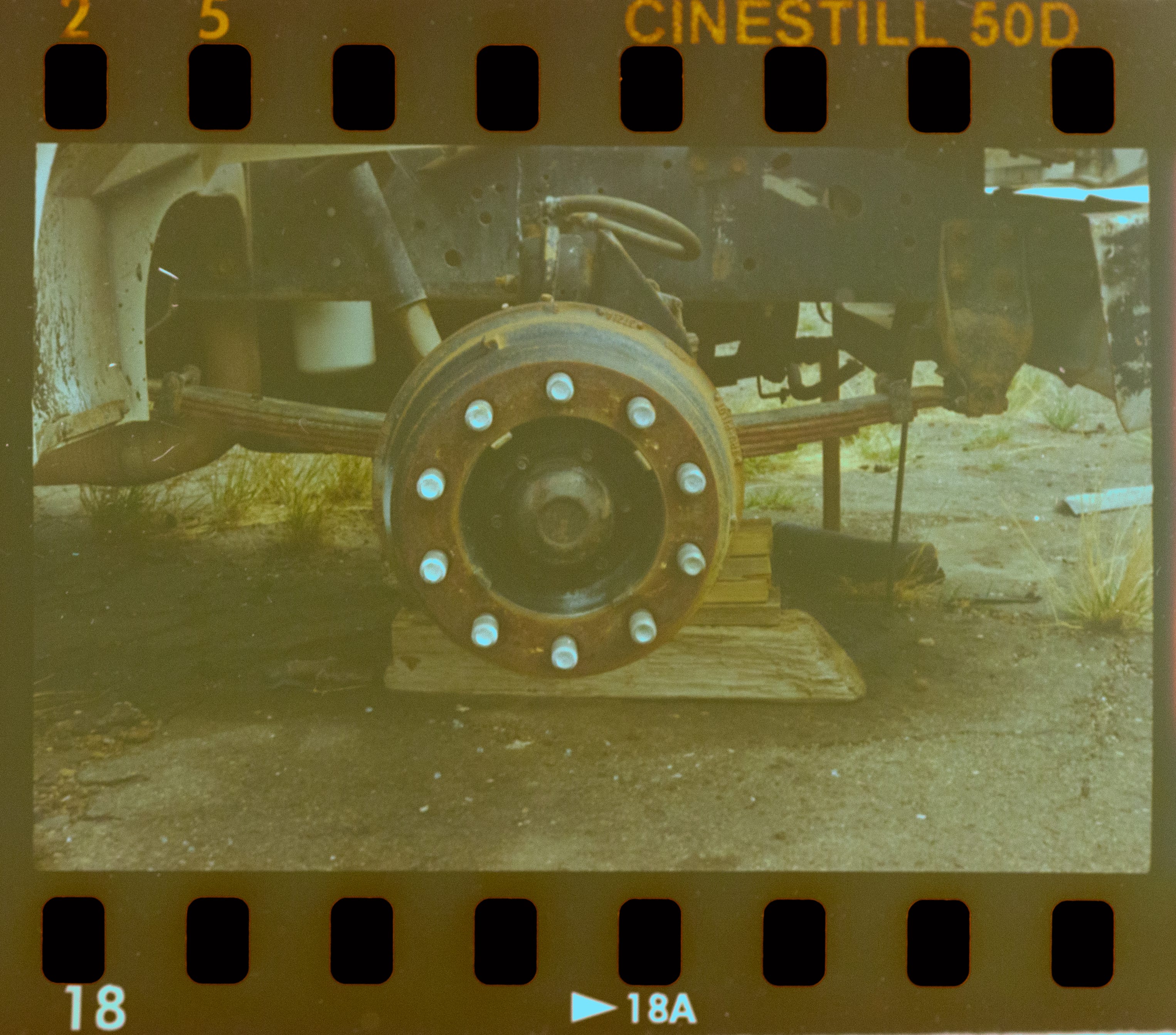
The top shot, when scanned at the lab, was fairly crisp and very contrasty, which I liked. My POS is another example of me giving up on this particular scan. I got nothing here, I can’t understand why I couldn’t get close to the original scan.
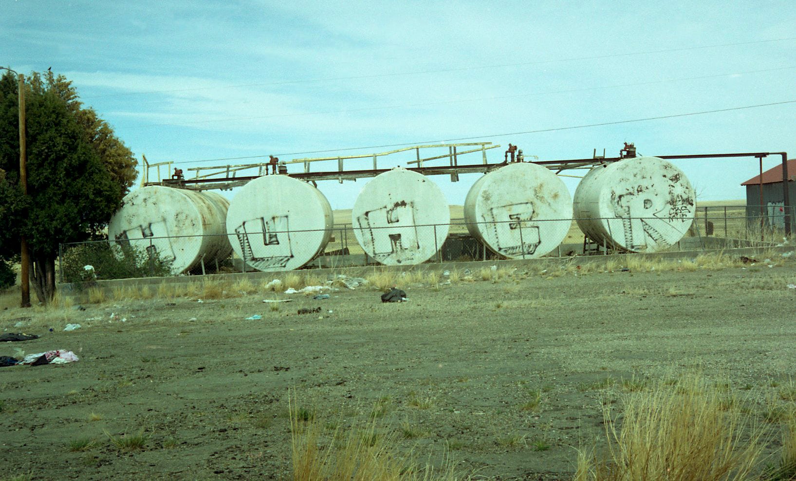
Tanks, for the memories…
and…
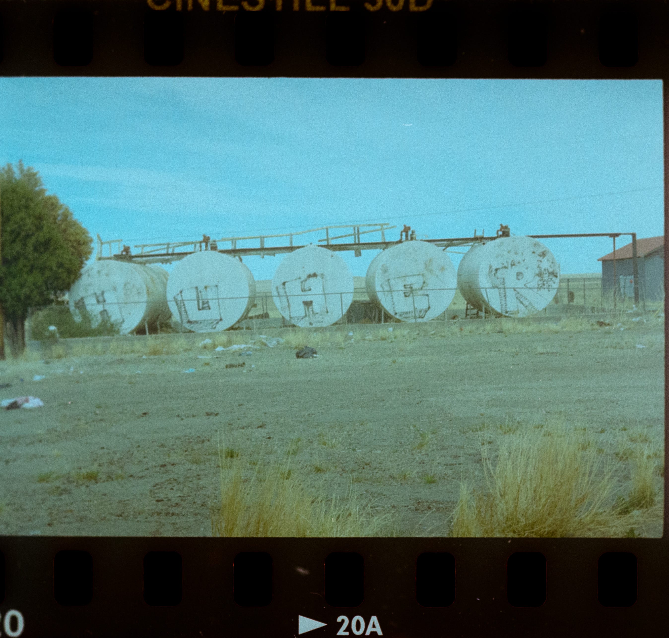
Still with that flat dynamic look, but closer to what I recall the colors looking like, that afternoon.
Cracking myself up…
Bleh!
And finally!
The original scan was pretty close to what I remember of this scene. Now that I look at it in comparison to my own edit, I see that the green cast was not as pronounced as I thought is was.
My edit, true to form (for now), is ridiculously flat. I think that I have short-changed the Petri’s color-rendering capabilities with my own edits. Black & White scans are easier for me to get close to what I am after, but that is not surprising to me.
I will get better. I am certain that there is a YouTube video out there that features someone who can tell me what settings I have moved too much/too little, that has given me this flat dynamic look.
I might try a different film stock, though.
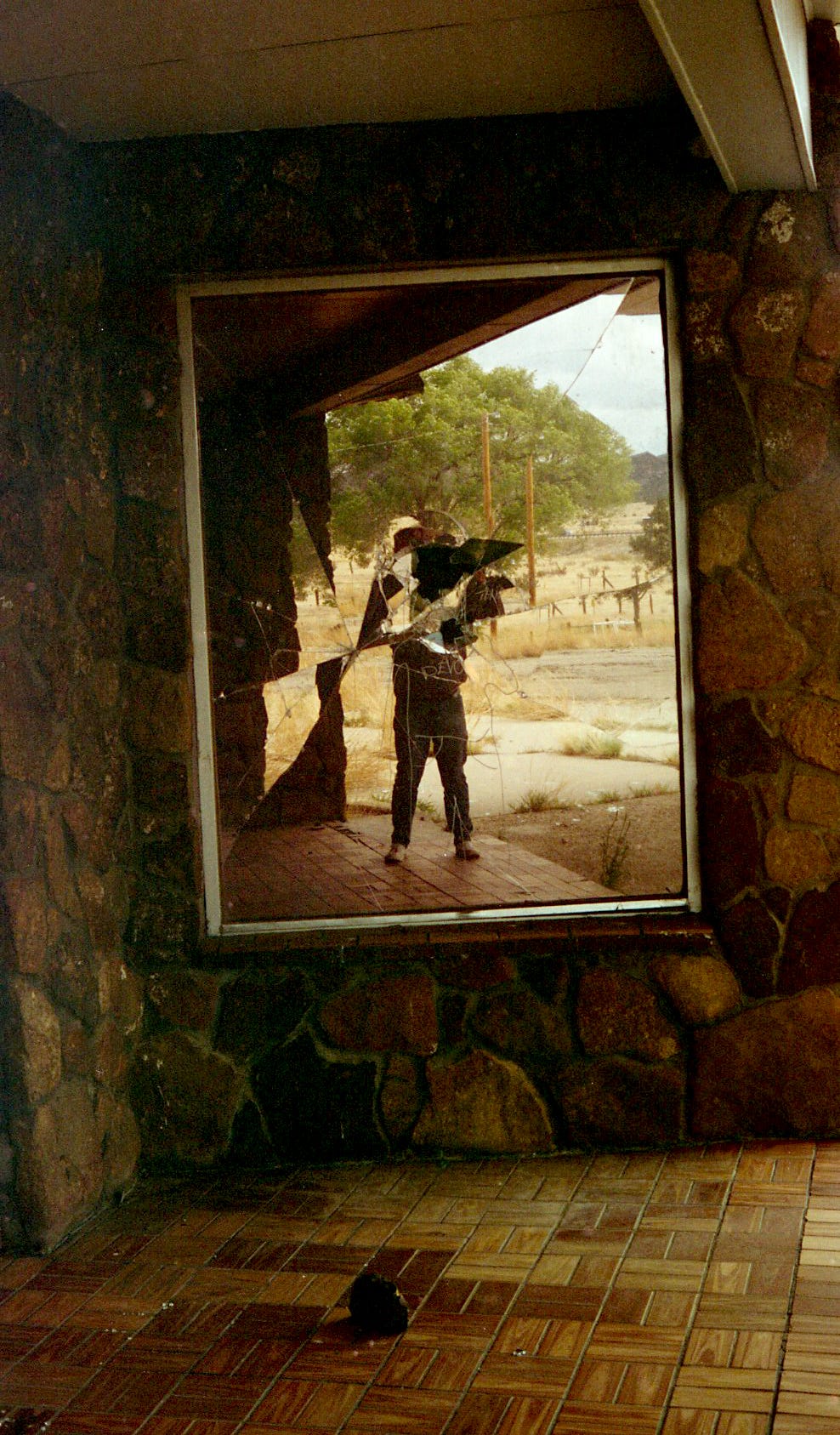
I don't know anything about the technical aspects but I came here to say the photo with the broken mirror is SO cool! I really like how that looked.
it is the scanner settings that are not right. i don't understand why in your scans i can see the sprockets but let's start with the basics.
1. when scanning, the "shinny" side of the film is down (easier to see on the b&w film) or follow the markings on the scanner
2. the best results are when the film is not touching the glass (not the top, nor the bottom) of the scanner and it is at 1-2mm distance from it
3. start with the most simple scanner settings (colour negative, a billion colours, 1200dpi) and no enhancements. add more sharpness, saturation, colour correction only after.
4. scan in tiff format instead of jpg
i know you will get there, wish you all the best!