

Well, it has been an exceptionally busy week at work. I have had a few ideas for subjects to talk about, but only now have I had a few minuets to sit at the keyboard. Also, I have been dealing with a screwed up back for the last two weeks, so sitting at the keyboard has been painful at times.
This post is going to feature a fun item that I had come across my desk the week before last.
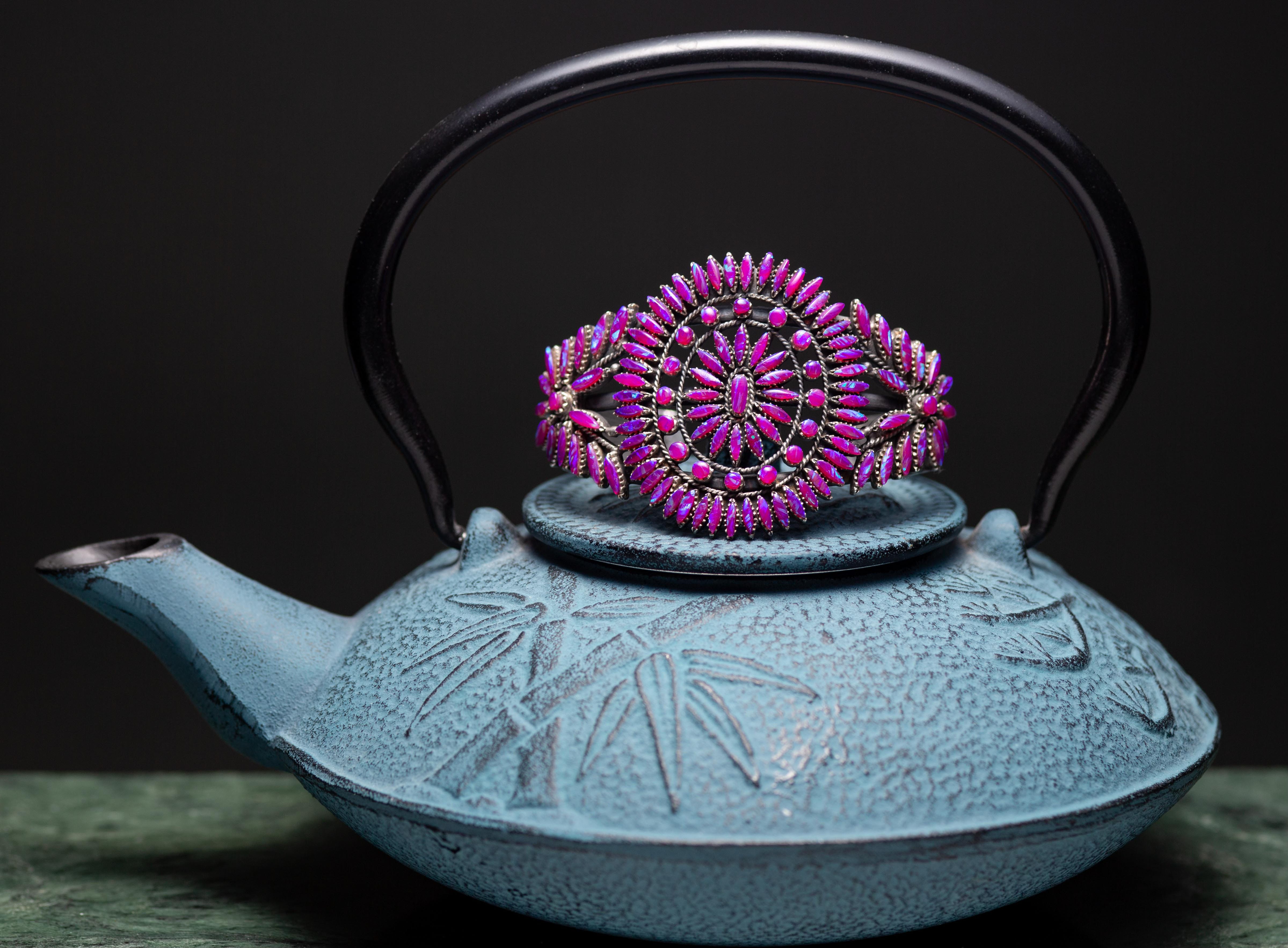
At first, I looked forward to shooting this bracelet, mostly because of the abundance of fire opals in its design. Occasionally, we will get rings with opals, sometimes, even fire opals, but I have never seen anything like these fire opals. The dark purple color, is fairly unique, and comes from South America - Chile, or Argentina - I think.
At first I looked forward to this piece, but it quickly became frustrating, because I wasn’t getting the shot that I saw in my mind.
I took this shot with my usual set-up. The strobe was set on its typical power setting, the gridded softbox was used, I had a white bounce-card in place (though I ended up not using it), I was shooting in a RAW file format and I was shooting through my favorite lens for close work, my Zeiss Makro-Planar 100mm.
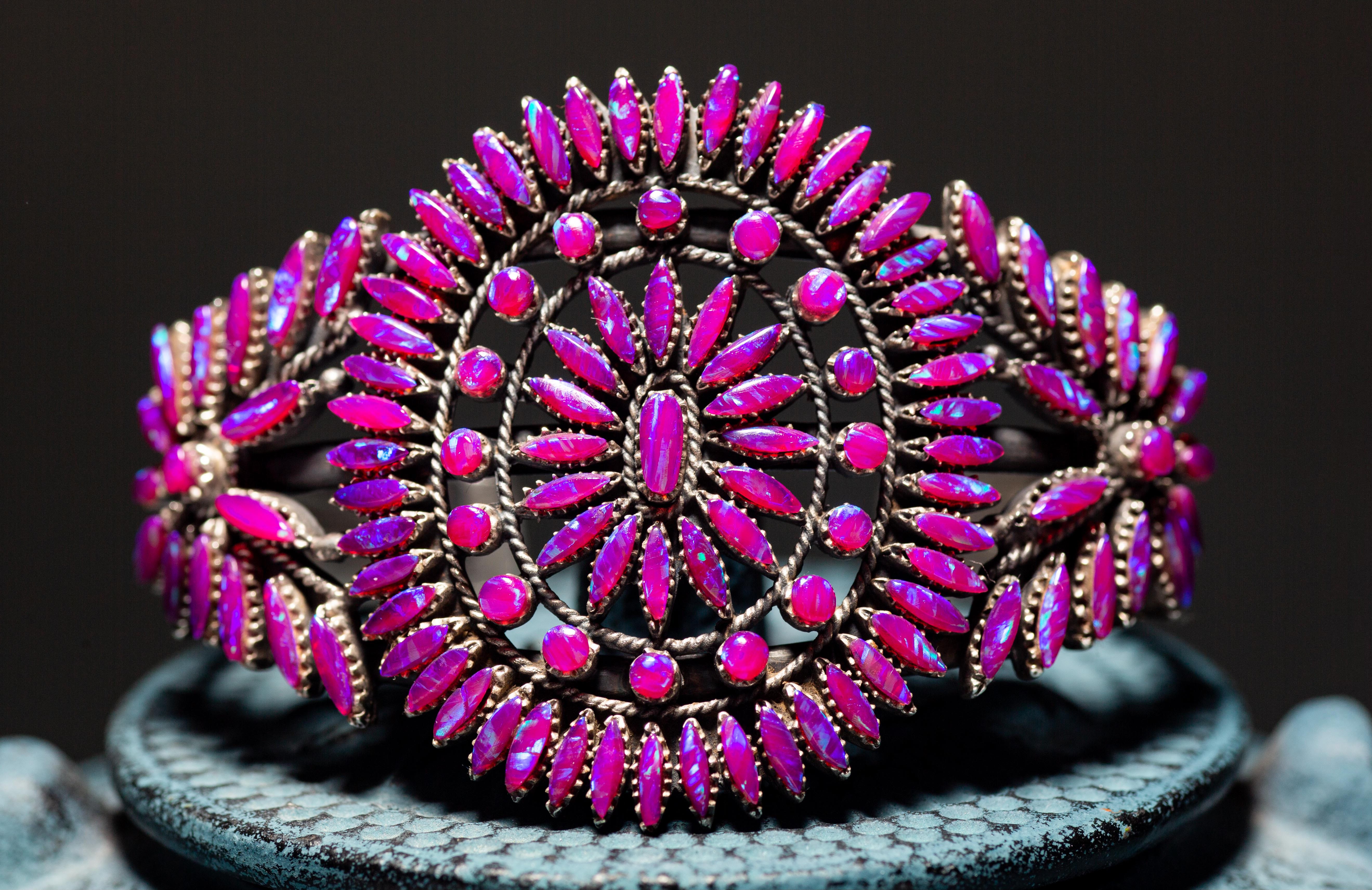
In most respects, this shot looks fine, until you look closely.
The photo that you see here is my end product. I got to this (barely) acceptable result after massaging the photo for close to 30 minutes. I tried several different approaches, trying to find a combination of adjustments that would get me what I wanted, to no avail. This, was as close as I got.
There are two attributes of this photo that I do not like, that caused me no small amount of consternation trying to change. First, the overall quality of the light has a bit too much glare. It’s almost as though there is a slight hazy film over the whole shot. Usually, I would boost the de-haze filter to compensate, but I would crush the highlights in the opals when I did.
The second attribute that disturbed me was the lack of brilliance in the luminescent inclusions in the stone. Opals, have what’s called a “play-of-color” quality, those parts of the stone that refract light in “opalescent” ways. I wasn’t seeing these very clearly, and those that I did, seemed dull. The shot above did not match what I saw with my eyes, that was the main sticking point (I buried the lede, there).
I stewed about this for a time, got more frustrated, tried to force the issue (never a good tactic), and finally found myself at a loss as to what I could do to get the shot that I wanted. What I had forgotten was the most basic advice I would ever give someone in a similar situation… Do something differently.
DUH! I was being pig-headed and that resistance was causing me to forget about my Standard Operating Procedures. Here’s what I did.
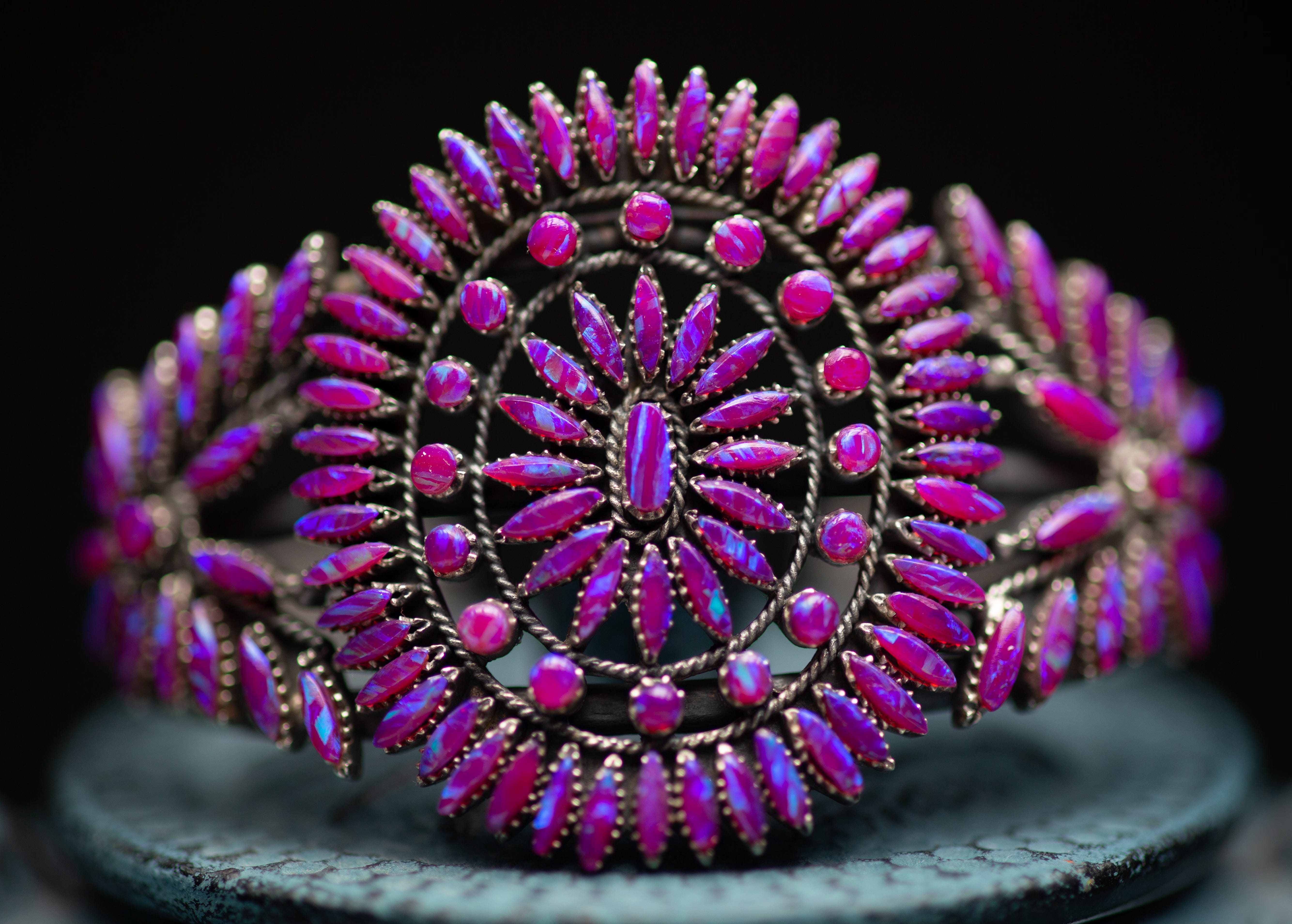
First, I changed my light. While I left the position of my strobe unchanged, I dropped the power to 20% of what it had been. I opened my aperture from 7.1 to 2.2 (the lens opens fully to 2.0), and I took my ISO from 200 (my normal, everyday setting) to 100. If would characterize this as “slowing” things down.
What you see in the second shot is nearly straight from the camera. I made only one adjustment; I boosted the contrast by a small fraction.
The most obvious change is that the colors are deeper. The higher light value, coupled with the tighter aperture setting, caused the depth of the color to washout, giving that “Hazy” looked I mentioned.
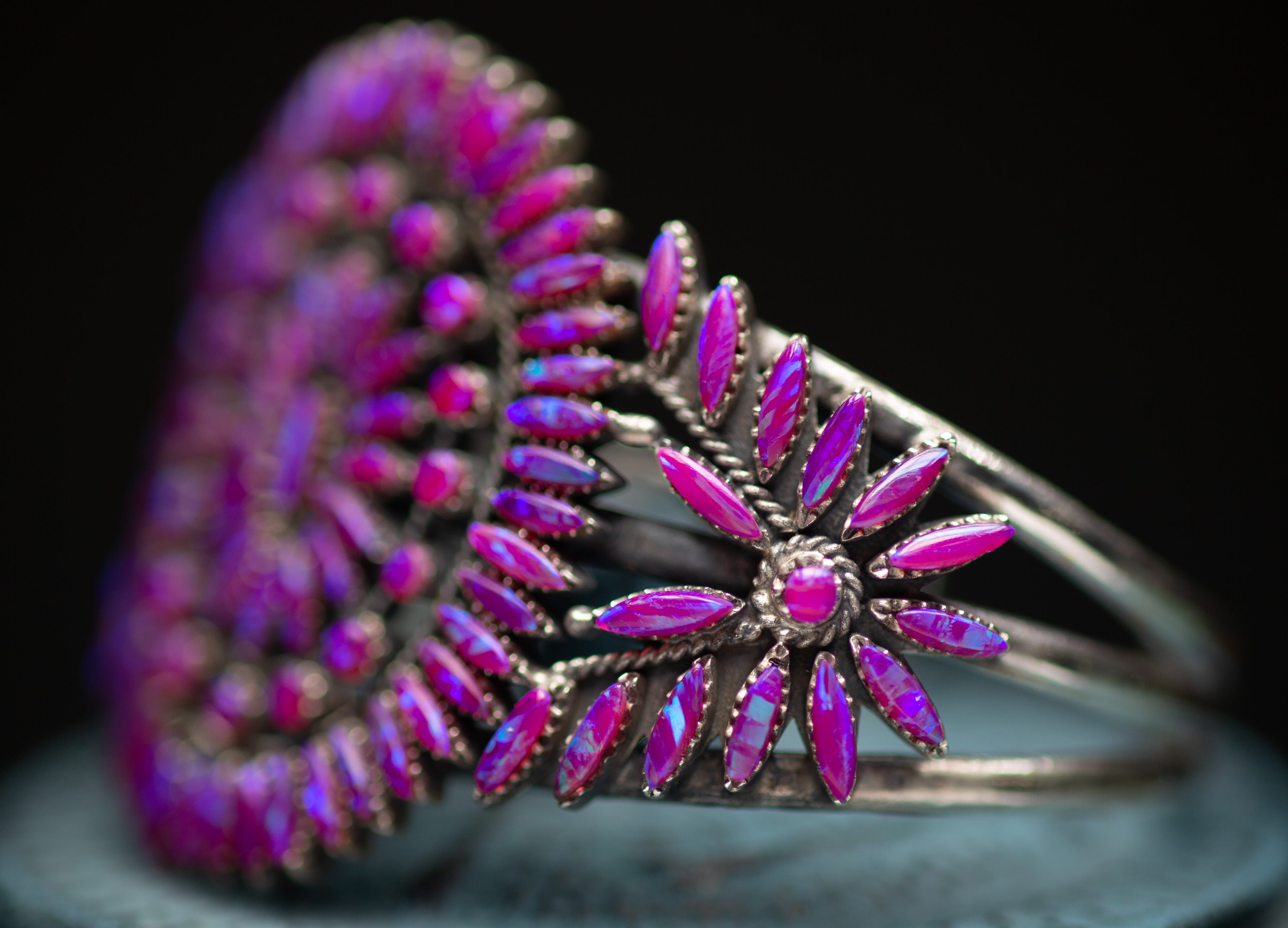
By lowering the power of the strobe, less light was hitting the stones. If I continue the metaphor of “slowing” things down, this lesser amount of light allowed for the light that hit the bracelet and wander, meander, or perhaps, stroll through the opals, rather than rush at top speed. This brought out much more detail in the inclusions, allowing the refracted light to develop to a greater degree. Essentially, the lesser light, that refracted through the inclusions, wasn’t having to compete with the greater power of the light from the strobe; a whisper, rather than a shout. Also, having the lens opened almost as far as it would go allowed for the better capture of the iridescence, but it also created a razor-thin depth of focus. This had the effect of making most of the bracelet look soft, but it also allowed for the depth of color and the highlights to be emphasized.
Let’s look at a side-by-side comparison.


You can see how the greater amount of light and the tighter aperture caused the first attempt to feel so bright and washed-out. It looks as though I was a film-noir cop giving the bracelet the third degree. The lowered light value, the wide-open aperture and the slower ISO, combined for a deeper, more detailed look at what makes this bracelet so interesting.
I am chagrined to write this post because it is a summary of all the things that I advise others not to do when they find themselves unable to achieve what they are after.
I was unable to get the results that I was looking for, but I stubbornly refused to think about making changes to my settings. Granted, I can get what I need from my usual settings 99% of the time, but I spent far too much time, effort and energy trying to be clever and get what I wanted without making changes. Hubris? Probably just stupidity. Once I made the decision to change my settings, it took all of 30 seconds to shoot the better picture. Alas.
I was very happy to see the hoped for results with the altered settings, but I was disappointed in myself for taking the hardest path to get there. Stupidity offers the toughest lessons.
I don't like jewelry in general, but wow this piece stands out! I want to draw it on a character somehow. Also the contrast with the tea pot is really cool.
I was just looking at the teapot. 🎉